0 Comments
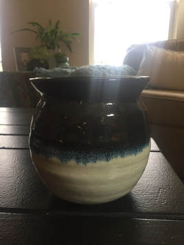
This is the project I am using for my second project since I had no group for the group coil. This is one of the favorite pots I've made, the shape is very round which I was going with. I think the art element for this piece would be color because it creates contrast. The black on the top makes it look smaller while the white on the bottom makes it seem wider. The design element would be shape because of how round it is. I used black glaze on the inside and the top half, and then used white on the bottom half. I like how the white and black mixed in the middle. I think that the mood of this piece is calm and earthy.
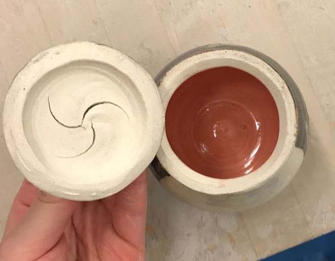
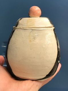
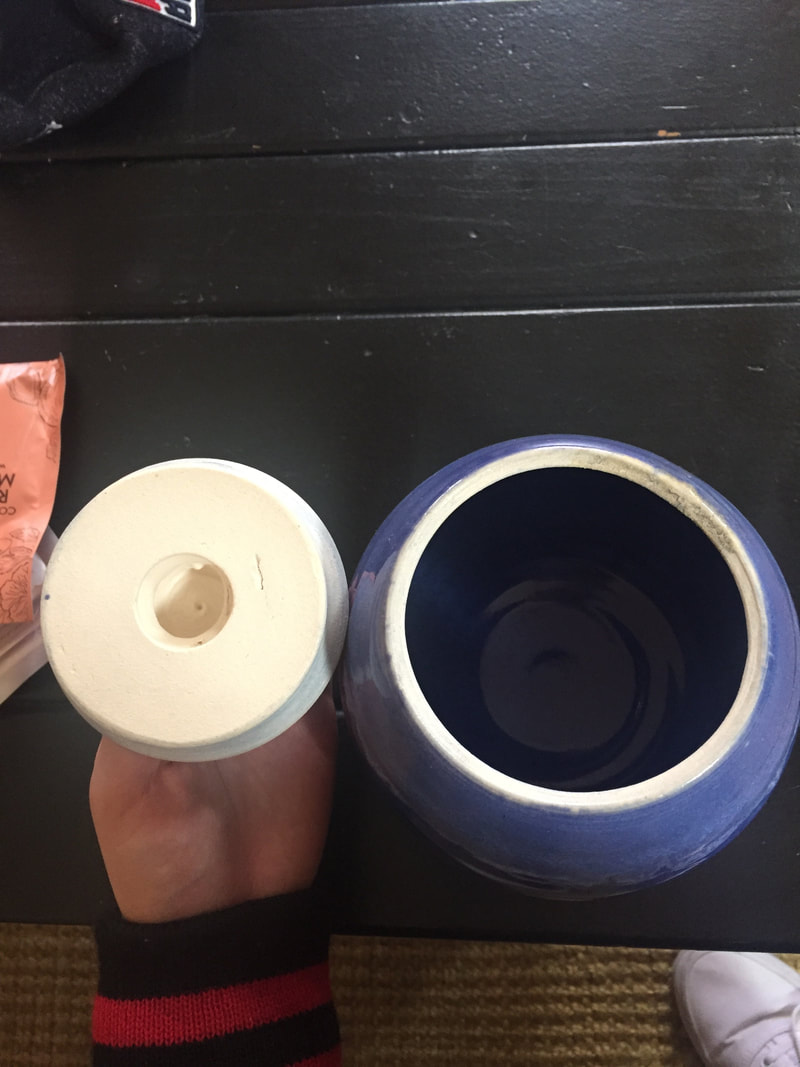
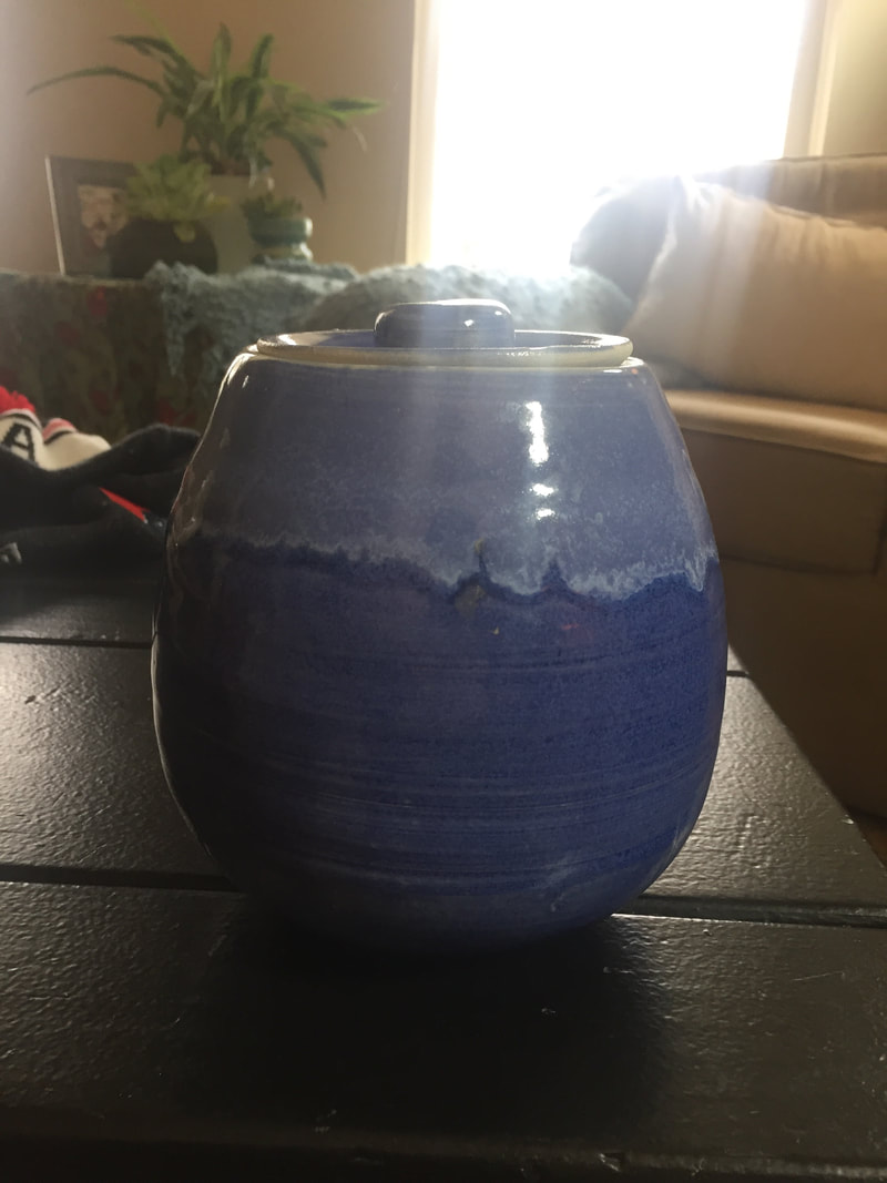
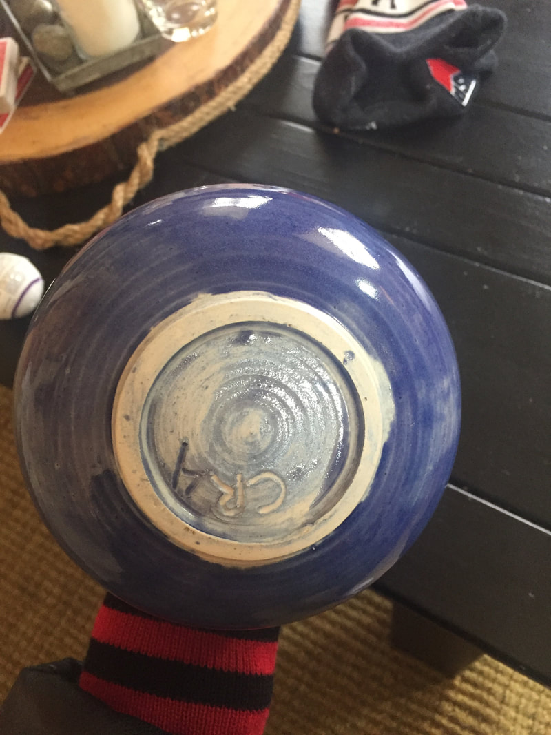
This is my lidded project. I personally love this project. I threw the base and didn't know what to do with it so I threw a lid that ended up fitting perfectly. I used Sydney blue on the outside and the inside. The lighter blue on the top is white over the Sydney blue. I think that the art element for this project is color because of the way the white blends in with the blue. The design element for this would be shape because of round and egg like it is. The mood of this bowl is calming.
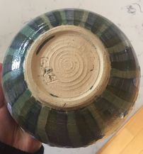
This is my big bowl. I threw it with Sea-Mix, and it is large enough that my family uses it as a fruit bowl. For the glaze, I used three different colors of underglaze. I used two blues and a green. I thought that just stripes wouldn't look good so I decided to use white on the outside and inside. I like how the white blended some of the stripes. The art element is line because of how all of the stripes on the outside work together. The design element is shape because the lines on the outside make the bowl look wider and more round. I think the mood of the bowl is almost circus like because of the stripes.
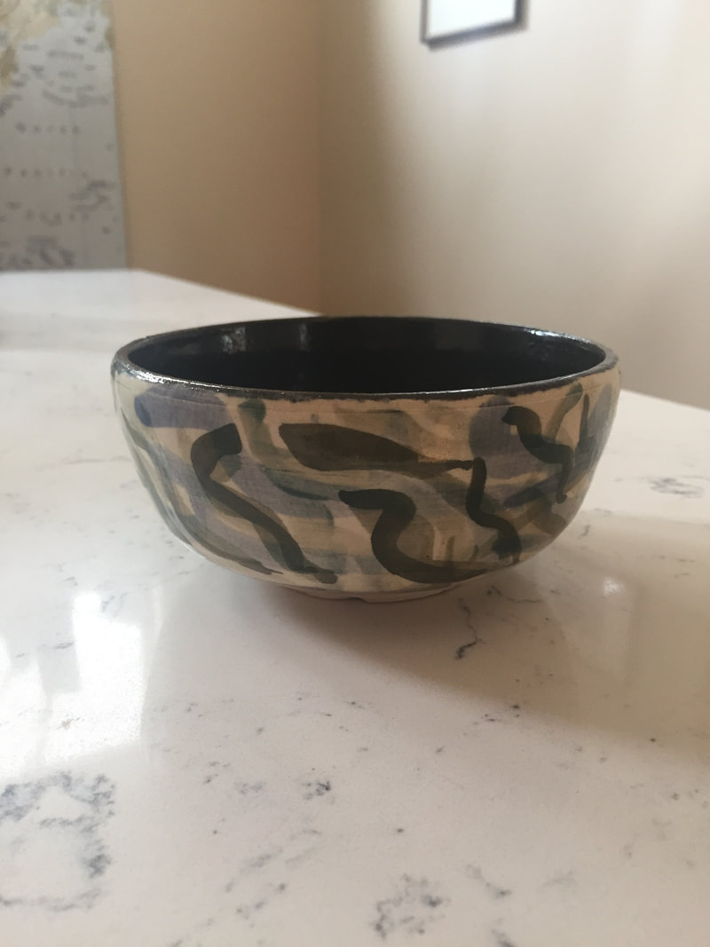
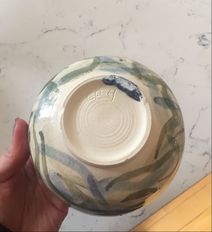
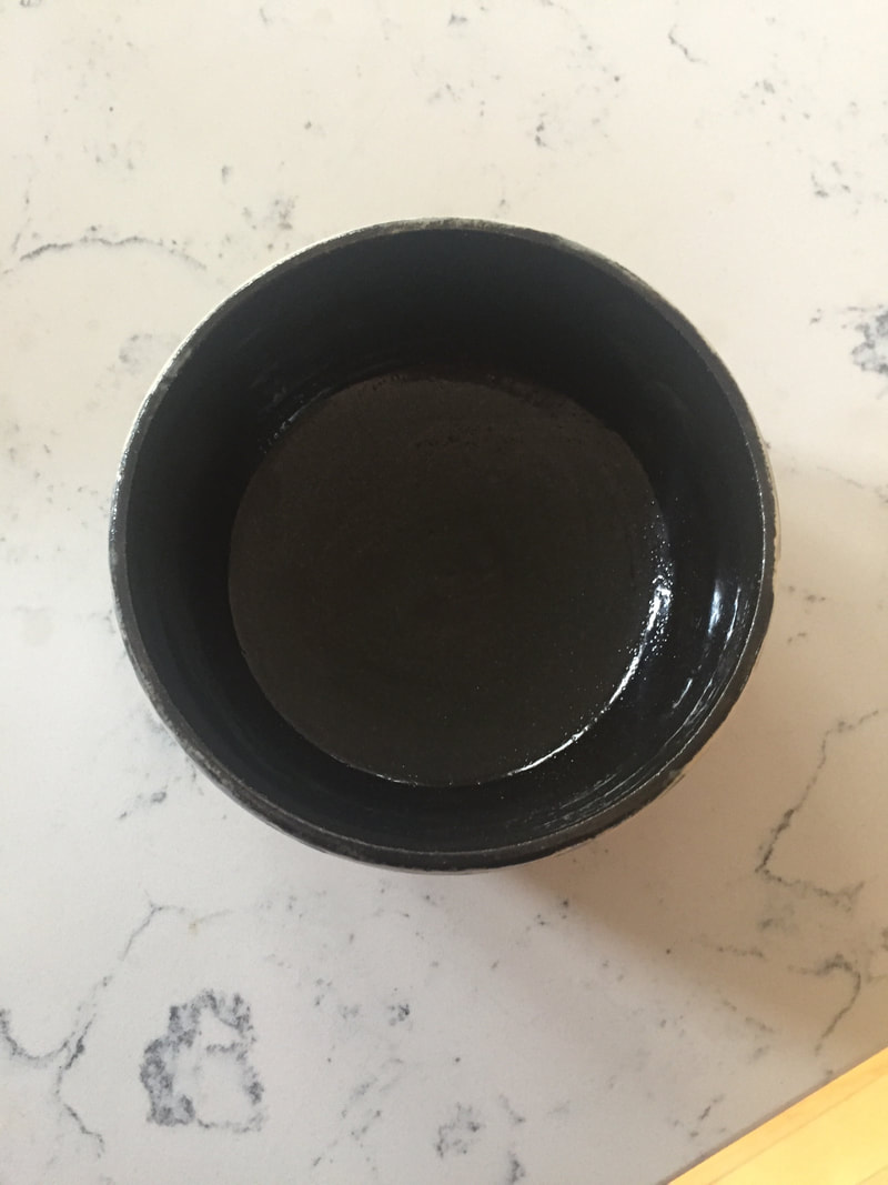
This is my third bowl. My shape is still not quite there, but I like how the bowl turned out. I decided that I wanted to try something new with the glazes, so I used under glazes on the outside of the bowl. I used three different colors and then covered them in clear. The inside of the bowl is just black, which makes it seem deeper. My art element would be line because of all of the stripes on the outside and how they create movement. My design element would be movement from the lines on the outside of the bowl, or balance because the outside of the bowl is very crazy but the inside is just a solid color so it doesn't seem as crazy. My mood is channeling a bit of Mrs. Heideman. I know she has a frankenpot with a glaze like the one I used on the outside.
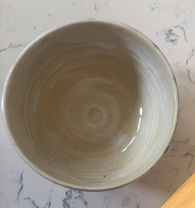
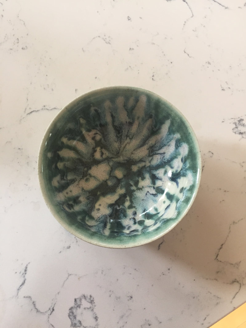
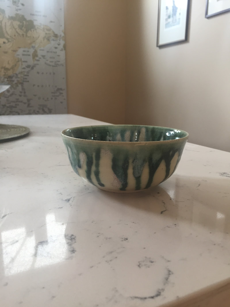
This is my second bowl. I like the shape of this bowl much better than my first bowl because I like the shape of it better, but it can still use some work. For this bowl I got a little crazy and mixed some different glazes together. I like the inside of the bowl better than the outside because of the design it makes. I think that the art element here would be lines because of all of the lines made by the glaze on the inside. The design element would be color because if it was just black and white it would not have the same effect. I think that the mood here is the ocean. The green and blue gives me a sea foam vibe.
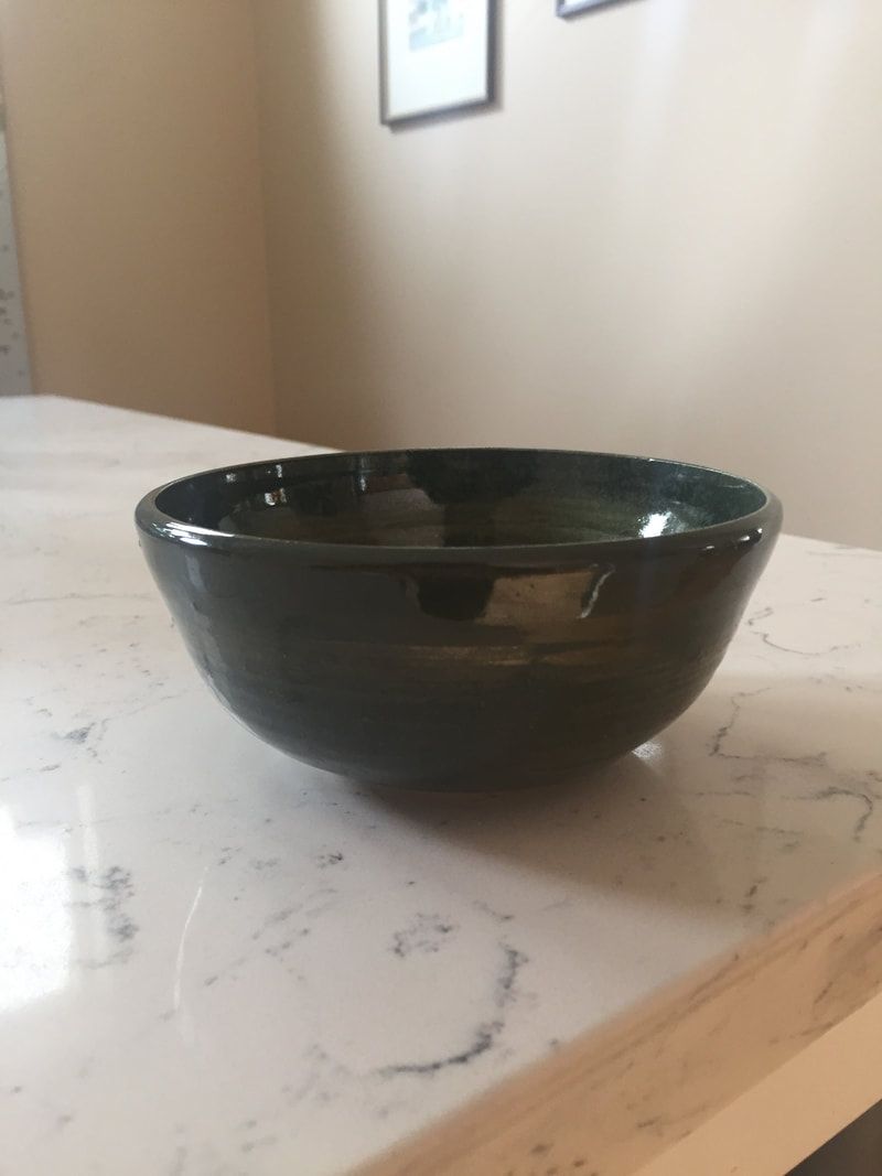
This is my first bowl. I think that it is ok for my first bowl back, but the shape could definitely use some help. I don’t know what color I used, because the labels on the buckets were not accurate. If I knew what it would turn out like I probably would not have used this color. I think that an art element would be space because of how the dark color makes it look deeper. A design element would be color because it plays into the art element. I think the mood is calming.
|
 RSS Feed
